I'm just going to jump right in and go over the most popular trends that I see everywhere lately and tell you what I like/dislike about them and how to do them the right way!
DISCLAIMER: If you have any of this in your home, GREAT! This is just MY opinion.
Gallery walls: I have a gallery wall in my home. Honestly, I don't know a single person who doesn't. My issue with this one is when people use so many different things [especially like five different quotes that in no way go together] and just throw it on a wall and call it a day, then they cant figure out "what its missing." I also cannot STAND when the items are placed far apart or have no sense of flow or shape. The number one question I hear when someone does a gallery wall is, "Does this look too cluttered?" YES! Yes, it does!
TIP#1: Space the items closer together and use items that flow together. If you want to use a bunch of different colors try using the same color frames, this creates a uniform look so that it doesn't appear too cluttered. If you want to use different frames try using only black and white pictures, or only color pictures instead of a mixture between the two, this will also make it look more uniform. If you want to use multiple quotes try to find ones that go together, like different bible verses or different parts of the same quote or song framed separately.
TIP#2:Create a shape for the gallery. If its going on a staircase wall make the arrangement parallel to the railing. If its going on a square wall, make the arrangement square or rectangle or heart shaped. Don't just throw a bunch of frames and random stuff on the wall and call it good!
Ampersands: I don't get this one, AT ALL. An ampersand [the "and" symbol (&)] literally means AND. Nothing more. I have heard the weirdest "meanings" for the use of these from "life goes on," to "there's always more to do, see, be".... etc etc etc. NO! It means AND, plain and simple.
TIP#1: only use these when it makes sense. For example, I used to have mine and Zack's initials [JZ] on our bedroom wall and used a large ampersand in the center because LITERALLY, I wanted it to say J AND Z. I honestly see no other use for it.
 |
| our apartment 3 years ago... my style has evolved |
Chalk painted furniture: I don't necessarily have an issue with this one as I have chalk painted many items in my home, however, my issue stems from those people that say it requires no prep-work and the finish is just oh so perfect and never wears. My butt! First off, it requires MINIMAL prep not NO prep. You MUST at least clean the piece well before painting. As for the finish I like it but it definitely isn't a smooth, perfect finish like everyone likes to pretend it is. The worst part however is the durability. Chalk paint does not last! I painted my desk [four coats!] and I put a cup down on it 3 days after painting and sealing it with wax and it pealed right up! I know a lot of people swear by the wax but I call bull on that. I waxed my pieces super well and it had no effect. I ended up touching up paint on the desk and sealed it with polycrylic and its holding up well now but no paint finish should just scratch right off by setting a cup on it. Also, chalk paint is no faster than painting with regular latex paint or spray paint. Actually I think spray paint leaves a smoother, more even finish in a much faster time frame for much less money. Think about it: you have to clean the piece, paint 3-4 coats, sand the brush marks off, wax it and then re wax every so often. Latex and spray paint you rough it up [you do not need to sand it down completely!], spray it with paint [or do a couple coats of latex], spray [or paint] polycrylic over it and boom, done for life. I have done so many pieces like this that they have still held up years later!
Coffee bars: My problem with this trend is that people are creating spaces in their home that they probably wont use. I have a small section of my counter where I keep my Keurig and yes, I dressed it up a bit but I dont see the purpose of purchasing a buffet or dresser just to set your coffee maker and a bunch of random stuff on it.It seems like a waste to me. Why not just put it in the kitchen?
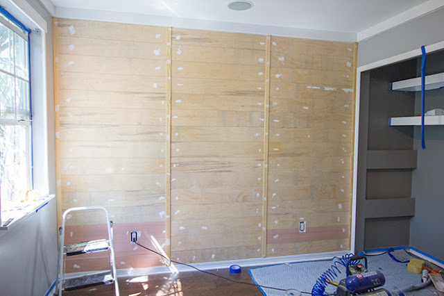
Plank walls: Not gonna lie, I love this one and plan to use it in my own home, but I think those people using actually pallets for this are just insane. no amount of cleaning is going to give me peace of mind about nailing chemically treated wood onto my wall, that's a whole lot of NOPE.
TIP#1: Use plywood! Seriously, its so easy to use, you can rip it down to your specific needs and stain/paint it any color you want and the best part is, its not going to make you sick. Win win.
 |
| this one by Jenna Sue designs can be altered to be a painted wall or you could stain it for a rustic look. Want it to look MORE rustic? Try staggering the plank seams and cut them different widths and stain/paint different colors! |
So these are the main trends I see lately. Do you have any that you cant stand or think is overused? leave it in the comments!
xoxo,
Jackie


No comments:
Post a Comment